|
|
Post by Eliath on Jun 23, 2018 14:50:42 GMT -6
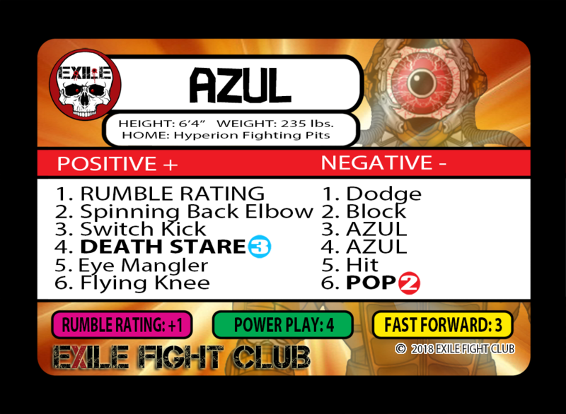
Thoughts/feedback on the vital stats area white background would be appreciated. I know there have been some complaints about the vital statistics blending into the background; this is the first attempt to fix that issue.
|
|
|
|
Post by Mr. Beefy on Jun 23, 2018 15:12:37 GMT -6
Thoughts/feedback on the vital stats area white background would be appreciated. I know there have been some complaints about the vital statistics blending into the background; this is the first attempt to fix that issue.
It sticks out more. Might distract from the name some. I'm not sure I like it other than being able to read it easier. I almost feel like the name box should be expanded. Like under the name type it in that box (smaller obviously). Then with the circle emblem expand that to be bigger to fit with the bigger name bar. ? ? ? |
|
|
|
Post by Mr. Beefy on Jun 23, 2018 15:15:21 GMT -6
Maybe it would help if it was rounded like the name part is on the right side? Maybe it looks a little off due to it being more square?
|
|
|
|
Post by Eliath on Jun 23, 2018 16:19:45 GMT -6
|
|
|
|
Post by Eliath on Jun 23, 2018 16:29:15 GMT -6
|
|
|
|
Post by Eliath on Jun 23, 2018 16:36:49 GMT -6
|
|
|
|
Post by Mr. Beefy on Jun 23, 2018 16:46:51 GMT -6
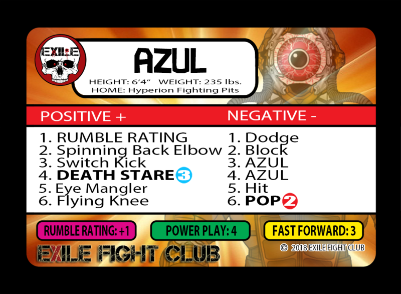
I think this one looks the most clean. Wife thought so too. Bigger emblem didn't look quite like I thought it would. |
|
|
|
Post by Eliath on Jun 23, 2018 16:49:30 GMT -6
I thought the same thing about the bigger emblem when I first made it.
|
|
|
|
Post by Eliath on Jun 25, 2018 10:19:41 GMT -6
Thanks Mr. Beefy to you and your wife for sharing your thoughts on this. Your participation is much appreciated!! It's a shame that the rest of the community isn't interested in discussing improvements that several people have privately spoken about a needed change. |
|
|
|
Post by Dustin on Jun 25, 2018 13:59:23 GMT -6
Thanks Mr. Beefy to you and your wife for sharing your thoughts on this. Your participation is much appreciated!! It's a shame that the rest of the community isn't interested in discussing improvements that several people have privately spoken about a needed change. I honestly think Eric took the ideas and made some changes. The game needs no improvements. People are having fun with the game. No need to change anything. I decided not to use DoH anymore. That’s my decision for my style of play. However, the game is great with an amazing set to come! |
|
|
|
Post by Eliath on Jun 25, 2018 16:18:13 GMT -6
Thanks Mr. Beefy to you and your wife for sharing your thoughts on this. Your participation is much appreciated!! It's a shame that the rest of the community isn't interested in discussing improvements that several people have privately spoken about a needed change. I honestly think Eric took the ideas and made some changes. The game needs no improvements. People are having fun with the game. No need to change anything. I decided not to use DoH anymore. That’s my decision for my style of play. However, the game is great with an amazing set to come! I appreciate your opinion, but you missed the entire point of this post. The game needs constant improvement or it will stifle and stagnate (hence what Eric is doing with Fight Pass). It's great that you decided not to use the DoH - good on you. Play your way! Finally, the game is indeed great, with the CoT set to come.
Perhaps you should take another look at what this thread is trying to do. If you believe that the vital statistics do not blend into the background on the darker background cards, you are fooling yourself. I invite you to take a look at Sidistic's card and hold it out at arms length and read her vital stats. Moreover, Eric is aware of the issue, as I'm not the first or only one to mention this issue to him.
You asked in the other thread, who's vilifying me - posts like this are a prime example.
I'm working for a solution, and asked for feedback on what I came up with. Eric is free to do his own thing, or not, but I'm working the problem. Again, I re-state that only Mr. Beefy seems to get that.
My apologies that your opinion regarding this game needing no changes is simply wrong. The foundation of what the game is trying to do is fantastic, but without constant tweeks and adjustments, the game will die. Is that really what you want with your "no changes are needed" comment? I certainly hope not.
It doesn't matter if you like me, don't like me, or what I'm doing. I'm trying to help offer solutions to a problem that Eric probably doesn't have time to address, or maybe doesn't exactly know how to address, for a game that we all love. Either help me out or shut your mouth.
|
|
|
|
Post by JJ_Strife on Jun 25, 2018 17:48:29 GMT -6
Thanks Mr. Beefy to you and your wife for sharing your thoughts on this. Your participation is much appreciated!! It's a shame that the rest of the community isn't interested in discussing improvements that several people have privately spoken about a needed change. I honestly think Eric took the ideas and made some changes. The game needs no improvements. People are having fun with the game. No need to change anything. I decided not to use DoH anymore. That’s my decision for my style of play. However, the game is great with an amazing set to come! OK, let me try in a less...abrasive manner. The game can always use improvements. It's just where that matters. With this topic, I've spoken to Eric about the bio stats being hard to see. When Big Chaddy Cool came out, I told him that they were literally impossible to see with the black text over the new CoT-themed background, specifically with Chaddy's being dark blue and black. Since then, he's started to give white text to those that have the dark versions of those backgrounds, making them much easier to see. I understand wanting to help make the game accessible, but arguing about it isn't going to solve anything. |
|
adam
BANTAMWEIGHT

Posts: 56
|
Post by adam on Jun 29, 2018 19:30:37 GMT -6
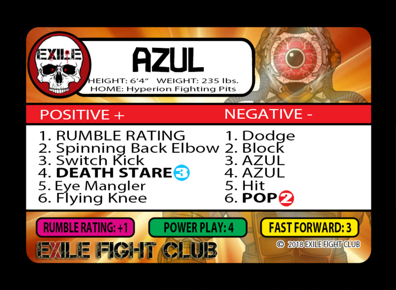 I like this one best of all, but you need to move over the icon or the words so they don't overlap. I don't understand why people aren't just answering your question. |
|
|
|
Post by Mr. Beefy on Jul 2, 2018 16:33:46 GMT -6
I like this one best of all, but you need to move over the icon or the words so they don't overlap. I don't understand why people aren't just answering your question. That is why I think the same thing with the smaller icon is better. That text is always going to take up decent space. |
|
adam
BANTAMWEIGHT
Posts: 56
|
Post by adam on Jul 2, 2018 16:55:52 GMT -6
That is why I think the same thing with the smaller icon is better. That text is always going to take up decent space. Yes it will, but the text looks like it could move the right and everything would look great. |
|